Our brand brings levity to the relationship that we have with receipts.
As we have a Jester archetype, we embody our belief that we need to lighten up the world, and torch the “receipt” tape. At our core we are enthusiastic, passionate, and refreshing. We honor a bit of fun in how we relate and communicate with others about what we do. This language is carried through our logo marks, brand colors, and the tone of voice in which we speak.

Is It Love or Hate?
We love having purchase information at our fingertips. Where’s the hate? The hate is in the waste caused by receipt paper. Paper receipts generate 1.5 Billion tons of waste annually — enough to cover ½ of California! By switching to contactless receipts, you’ll be preserving the planet, and saving yourself from a waste headache.

PRIMARY SENTIMENTS
Our logo mark itself embodies our break-up with paper receipts. The heart is representative of both a paper receipt being torn, as well as a heart breaking. The use of pinks and reds embodies the pain of an ever present break-up. This is our primary logo, as it dots the ‘i’ with the broken heart.
Second Thoughts...
We also have a secondary logo mark that is utilized when there is not enough vertical space. Typically you will see this logo used in website headers, and other places where narrow space is the only option.
![]()
When placing our logo on a dark colored background, the colors shift. You’ll need to utilize a reversed logo, where the type is white, and the heart contains more white tints than it does when it appears on a lighter background.
WE NEED SOME SPACE
Clearspace is needed to define proper visual impact for the logo. Avoid placing any graphics, patterns, or other elements within the logo’s clearspace. To determine the minimum amount of clearspace needed, find the x-height of the ‘s’ in ‘Receipts’. With a little breathing room, we’ll all be happier.
Our Brand Has Clear Boundaries
The logos should never be altered in any manner. Here are some basic brand don’ts.

DON’T change the logo colors, or the logo mark colors in any way.

DON’T use secondary colors more dominantly than primary colors.
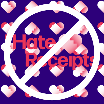
DON’T place the logo atop patterns, busy spaces in photography or any other textures that might make the logo difficult to read.

DON’T add effects of any kind (such as drop shadows, outer glows, bevels, etc.) to the logo mark.

DON’T stretch or distort the logo.
This is how we write sweet nothings.
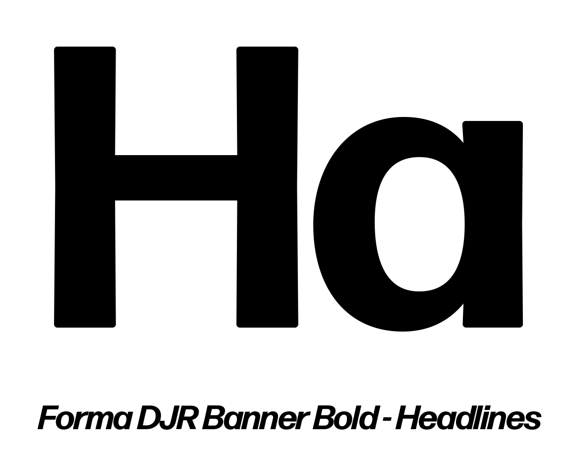
Our font family is Forma. We utilize Forma Banner Bold for headings and subheadings, and Forma Micro for our body. Gotta love that body.
Passionate red is our primary brand color
#E93458
We utilize this red in a dominant way, to show our fiery and passionate emotions. However, we balance that with love and care through our cooler, secondary color palette.
#6A2FE8
#8A86F5
#2D007A
#7BEDE6
For basic functions, like backgrounds and text, we also can utilize a functional palette.
#FFFFFF
#F4F4F4
#808080
#000000
Use your voice, but don't play coy.
We are a Jester archetype, and that should be apparent whenever it is possible in our brand voice. Through copy or spoken word, we want to incorporate a language that speakes to relationships of all kinds - be them romantic, familial, friendships, or even self love. We can connect better with our audience by adding some lightness and levity to this very relatable topic. Our relationship to our receipts is just another form of our relationship to ourselves and our environment. Keep the touch points saucy.