Our brand brings levity to the relationship that we have with receipts.
As we have a Jester archetype, we embody our belief that we need to lighten up the world, and torch the “receipt” tape. At our core we are enthusiastic, passionate, and refreshing. We honor a bit of fun in how we relate and communicate with others about what we do. This language is carried through our logo marks, brand colors, and the tone of voice in which we speak.

Why are we in love?
We love having purchase information at our fingertips. We love that we have an easy to use, digital platform, that takes the guess work out of tracking receipts. All of our incoming and outgoing funds are well tracked. This is love.
PRIMARY SENTIMENTS
Our logo mark shows the love we have for our digital receipts, by folding them in a heart, and tucking them into our digital wallets. This is our primary logo, as it dots the ‘i’ with the loved receipt fold. This mark utilizes a cooler palette to emphasize our cool heads in this loving partnership.
Second Thoughts...
We also have a secondary logo mark that is utilized when there is not enough vertical space. Typically you will see this logo used in website headers, and other places where narrow space is the only option.
![]()
When placing our logo on a dark colored background, the colors shift. You’ll need to utilize a reversed logo, where the type is white, and the heart contains more white tints than it does when it appears on a lighter background.
WE NEED SOME SPACE
Clearspace is needed to define proper visual impact for the logo. Avoid placing any graphics, patterns, or other elements within the logo’s clearspace. To determine the minimum amount of clearspace needed, find the x-height of the ‘s’ in ‘Receipts’. With a little breathing room, we’ll all be happier.
Our Brand Has Clear Boundaries
Our brand has clear boundaries The logos should never be altered in any manner. Here are some basic brand don’ts.

DON’T change the logo colors, or the logo mark colors in any way.

DON’T use secondary colors more dominantly than primary colors.

DON’T place the logo atop patterns, busy spaces in photography or any other textures that might make the logo difficult to read.

DON’T add effects of any kind (such as drop shadows, outer glows, bevels, etc.) to the logo mark.

DON’T stretch or distort the logo.
This is how we write sweet nothings.
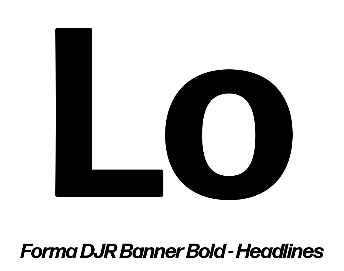
Our font family is Forma. We utilize Forma Banner Bold for headings and subheadings, and Forma Micro for our body. Gotta love that body.
Keep your cool. We have three primary colors.
#6A2FE8
#8A86F5
#2D007A
We utilize this cool palette to emphasize how connected, non-toxic, and independent we are. However, we balance that with a secondary palette that adds a dash of passion and self-care.
#E93458
#7BEDE6
For basic functions, like backgrounds and text, we also can utilize a functional palette.
#FFFFFF
#F4F4F4
#808080
#000000
Use your voice, but don't play coy.
We are a Jester archetype, and that should be apparent whenever it is possible in our brand voice. Through copy or spoken word, we want to incorporate a language that speakes to relationships of all kinds - be them romantic, familial, friendships, or even self love. We can connect better with our audience by adding some lightness and levity to this very relatable topic. Our relationship to our receipts is just another form of our relationship to ourselves and our environment. Keep the touch points saucy.